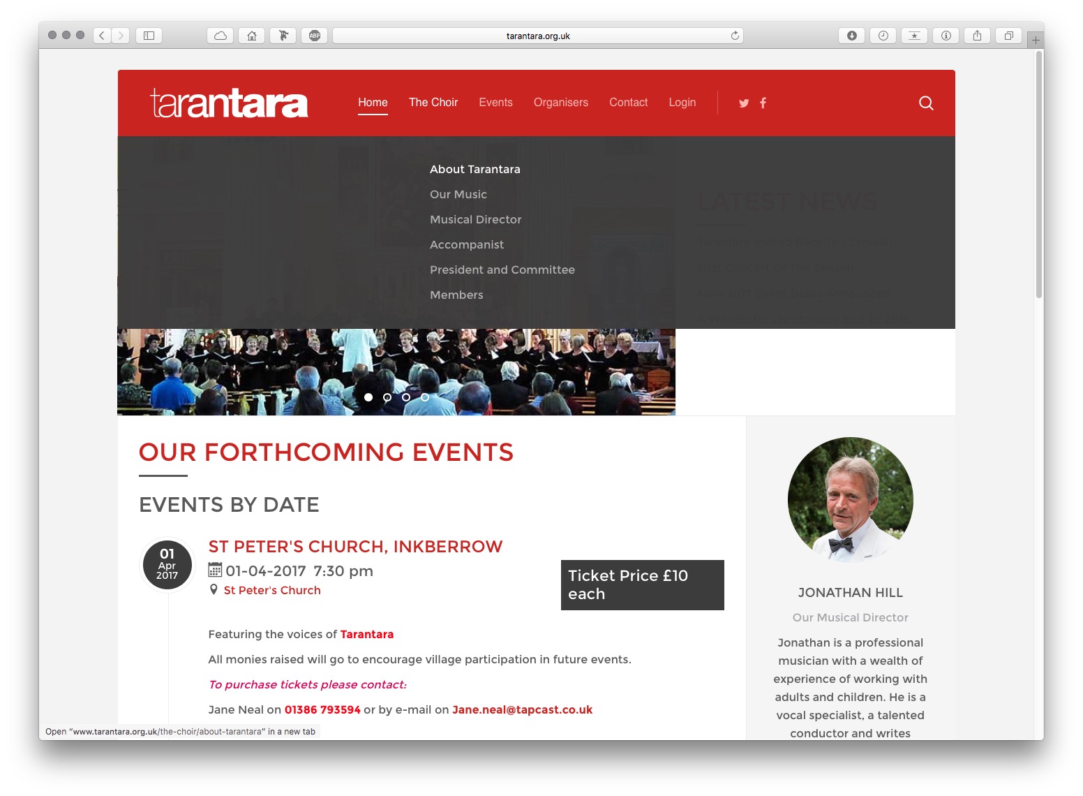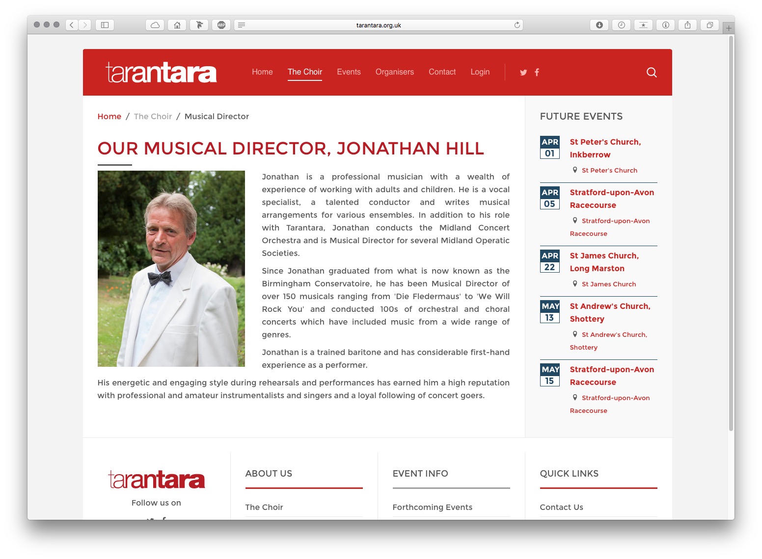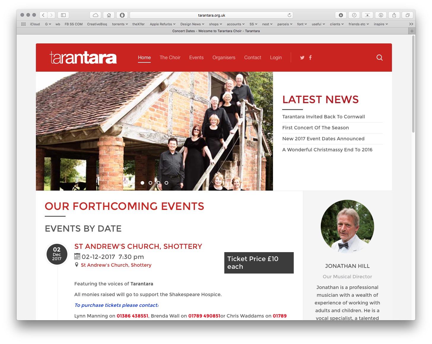
Tarantara | Logo, Branding & Marketing


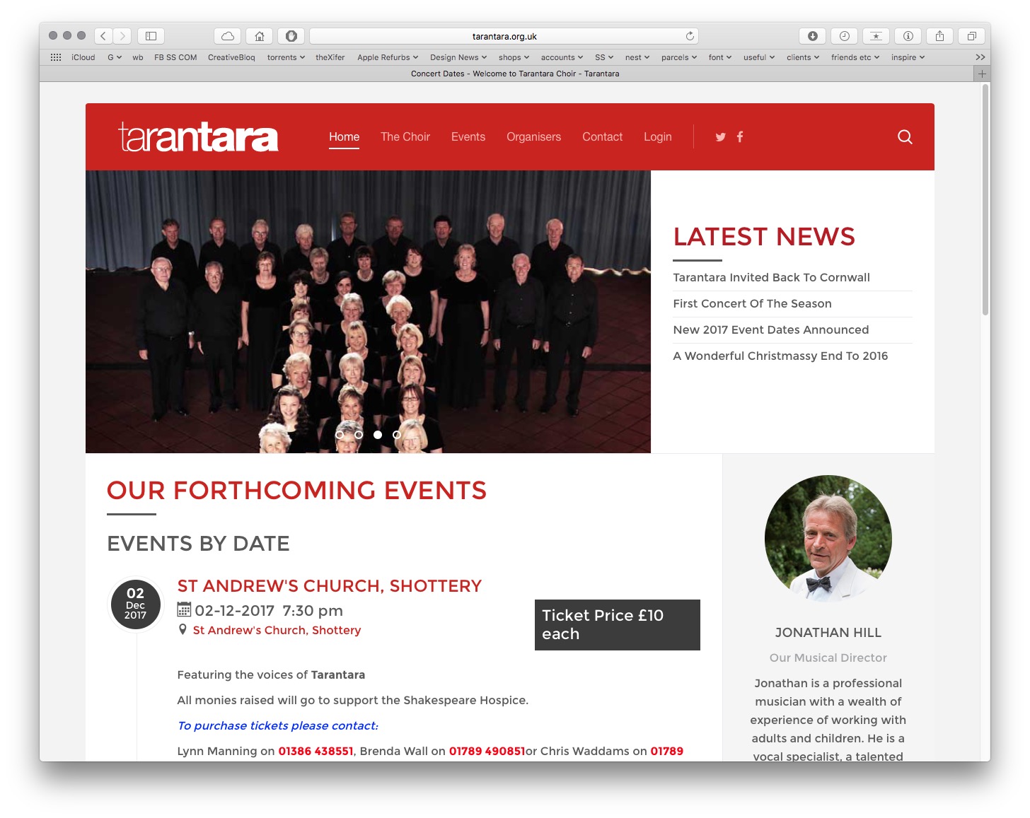
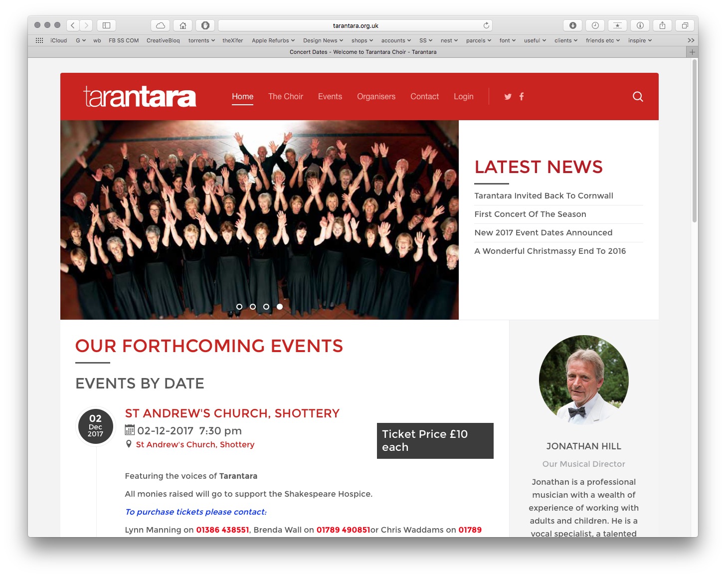
Tarantara are an auditioned mixed choir comprising of over 60 enthusiastic members whose aim is to enjoy themselves singing and performing to the highest standard.
We were honoured to be asked to recreate a new logo for them including a completely new look and feel for their marketing/advertising and to be used at their many diverse events. The only stipulation was that the strong red brand colour had to remain so an ideal open brief!
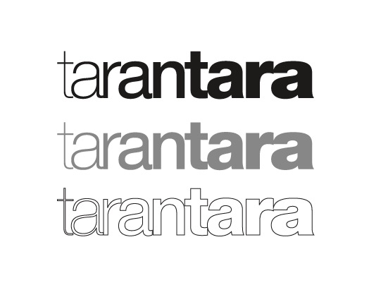
We brainstormed various different design concepts with alternative options for using the name and options for typography and the chosen logo is opposite. It's quite a simple logo on the face of it as it really is pretty much the typeface Helvetica in varying weights as you read along the name but the spacing and minimal character shape revisions make all the difference. The devil is in the detail. The idea is to give the impression of volume and sound increasing/varying and also of diversity, which the members of Tarantara most certainly are and to their benefit.
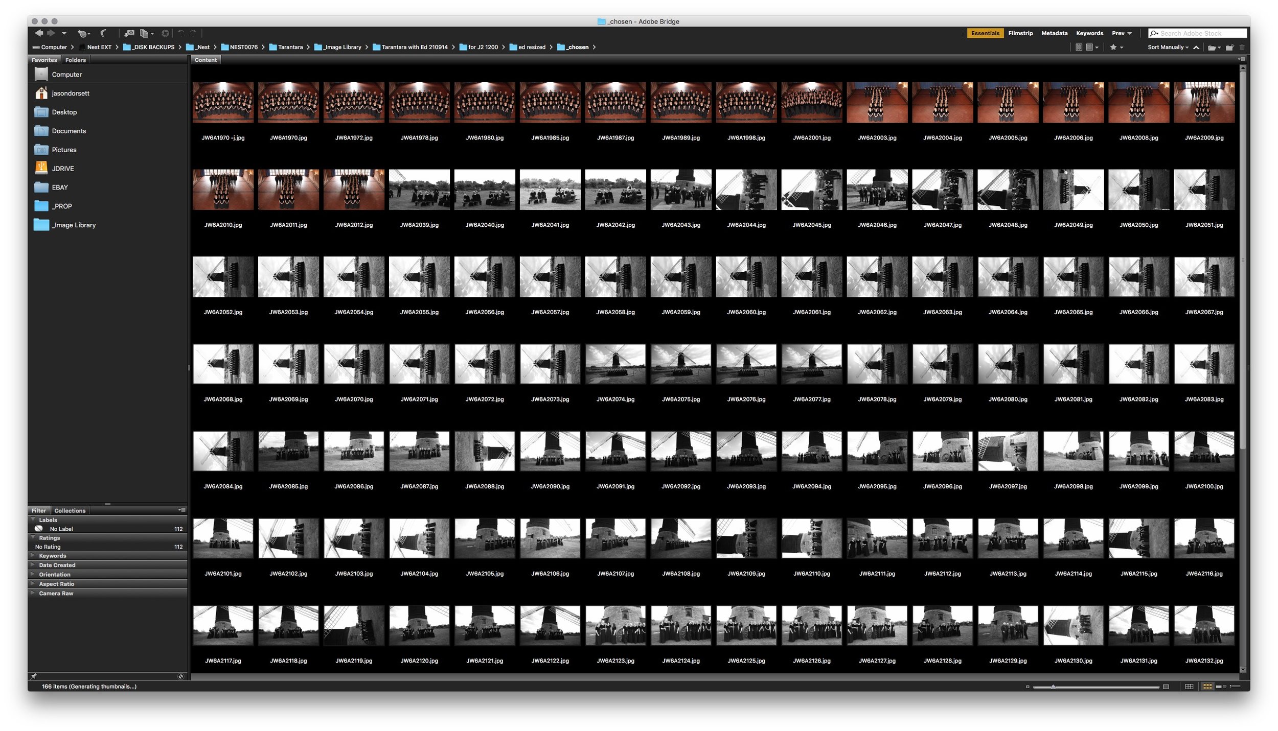
We also had the honour of directing and shooting a library of images for their future marketing. We shot these on location and retouched shortlisted/chosen images for future use, some of which you can see on this page.
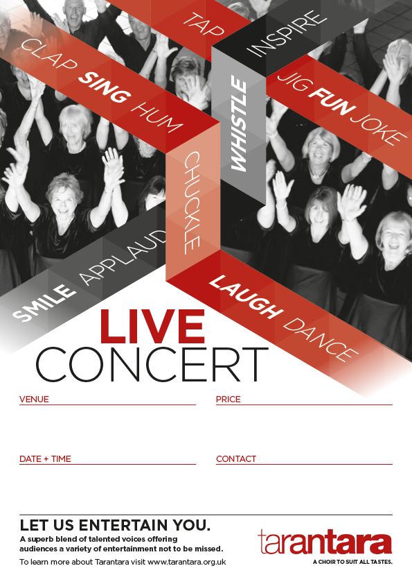
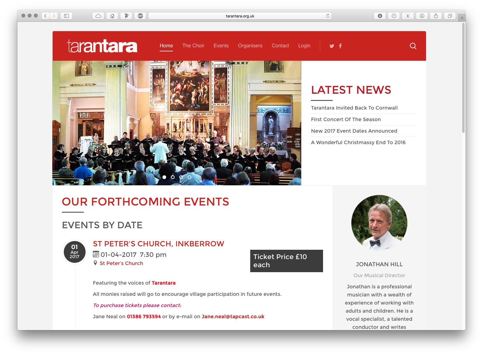
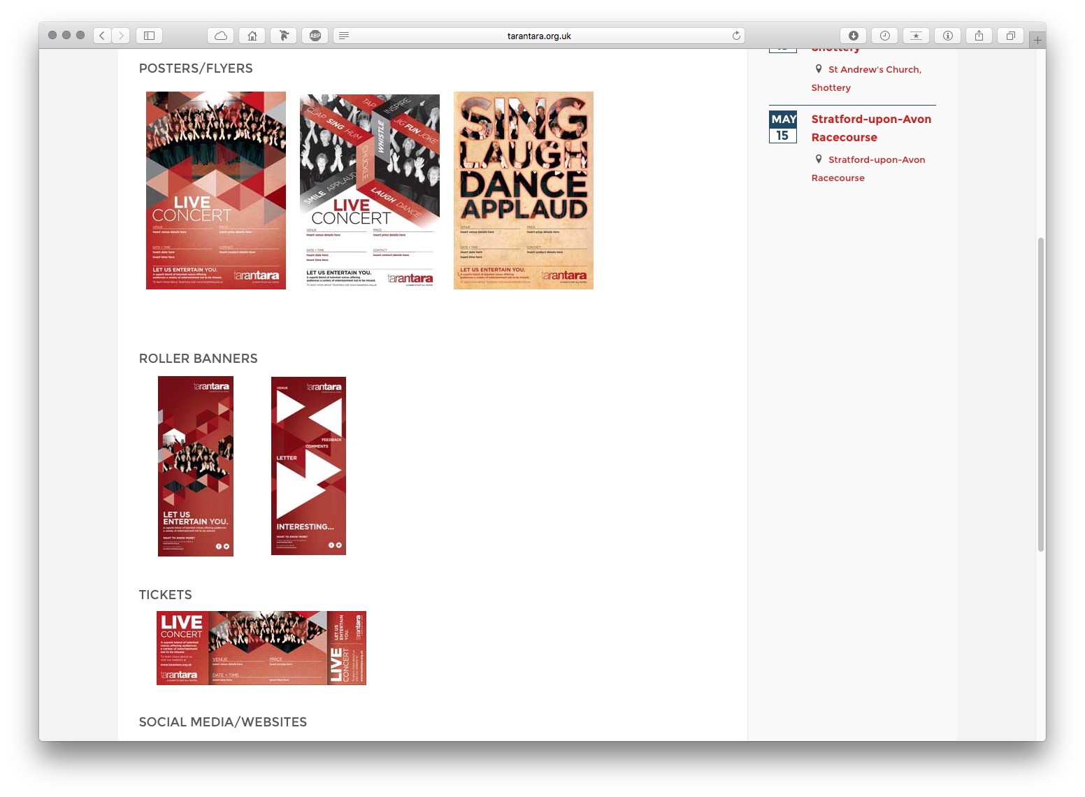
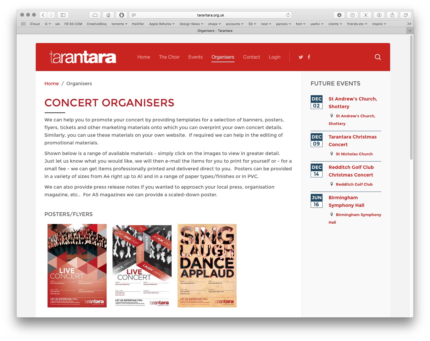
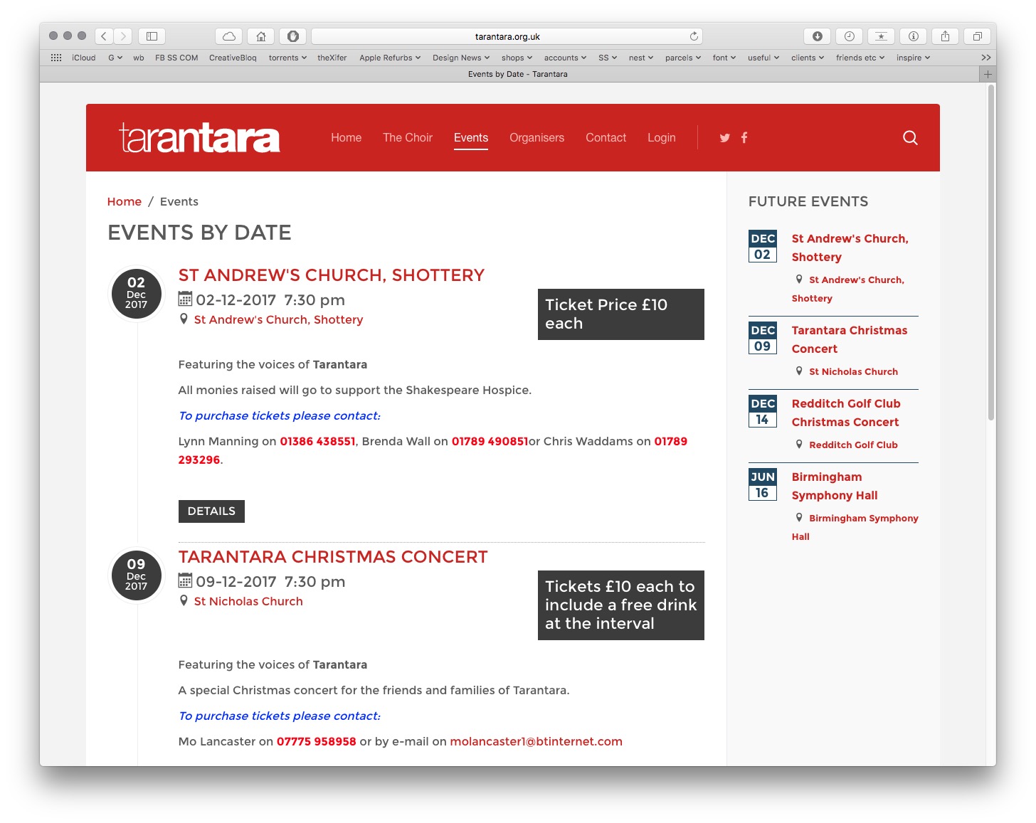
Once the logo and branding theme was signed off, we created various marketing elements including single and double sided roller banners, event banners, event posters in varying sizes and concert tickets with tear-offs.