RMT Motorcycle Training | Logo & Branding
Having done my bike training with Simon @ RMT and seeing first hand just how thorough he is I welcomed the opportunity to help with the rebrand of his business when he asked...
After a professional meeting over a beer or two, we got to work creating concepts for his new logo taking into consideration colouring, typography, logo design style and the overall look and feel.
Various alternatives were created ranging from modern, clean and minimal styles through to more traditional designs taking cues from bikes of yesteryear including BSA and Matchless with the 'wings' theme as inspiration. With Simons military background, we also created some in style to a forces crest or shield to inject some core/root feel and personality into the brand.
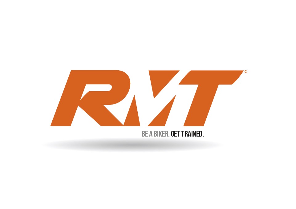
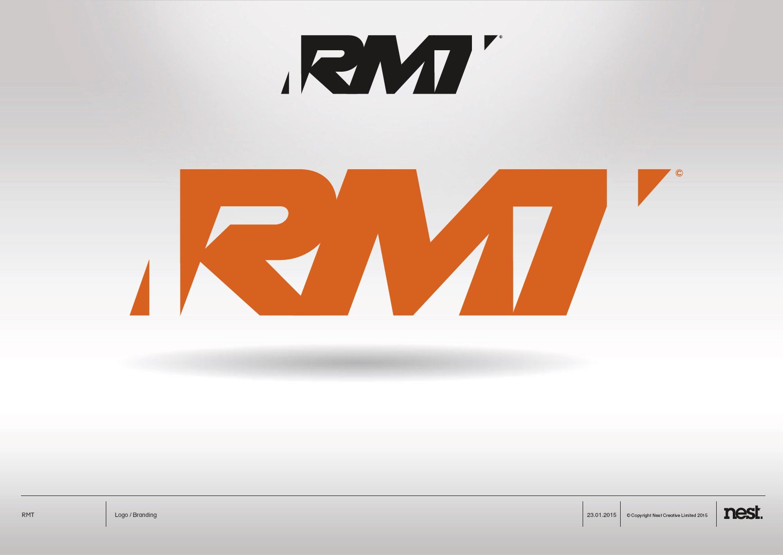
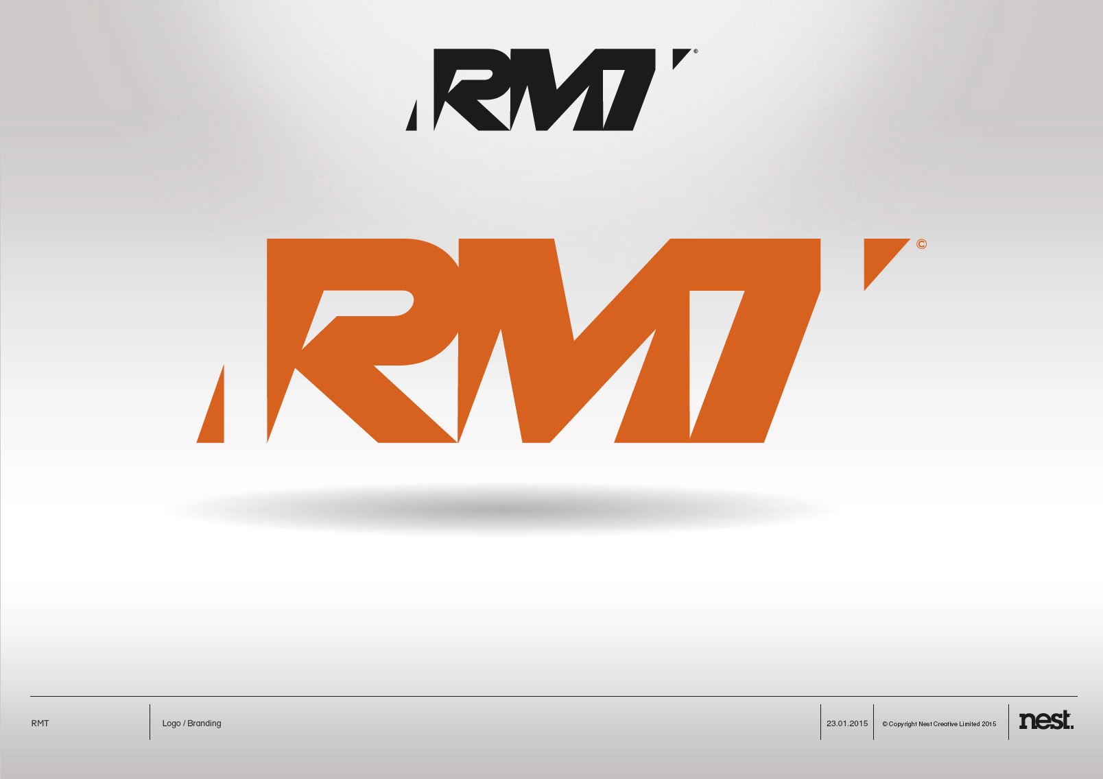
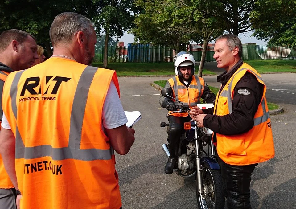
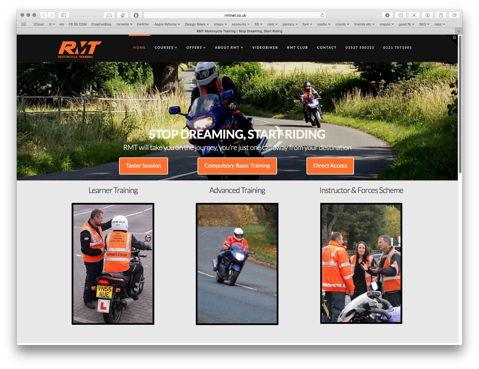
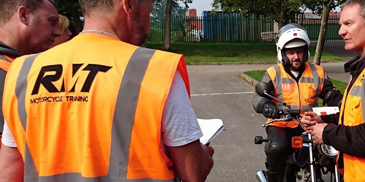
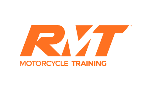
The chosen design was one of the more modern designs with a clean look and feel with an inversed 'silent' 'M' from the RMT. The core brand colours of orange and black were chosen as a subliminal feel that they are an emergency service which also coincides with the branded high-viz jackets worn on all training.